Our marketing department wanted to draw more attention to our retailer finder on Baby Lock, a non e-commerce site that markets high-end sewing machines and sewing accessories. I added a new Find a Retailer button on the product display page (PDP).
On the old PDP, users often struggled finding the compatible accessories section, which was previously at the bottom of the page in a banner-like callout. My secondary goal with this redesign was to a direct link to this above the fold.
Initial Sketches
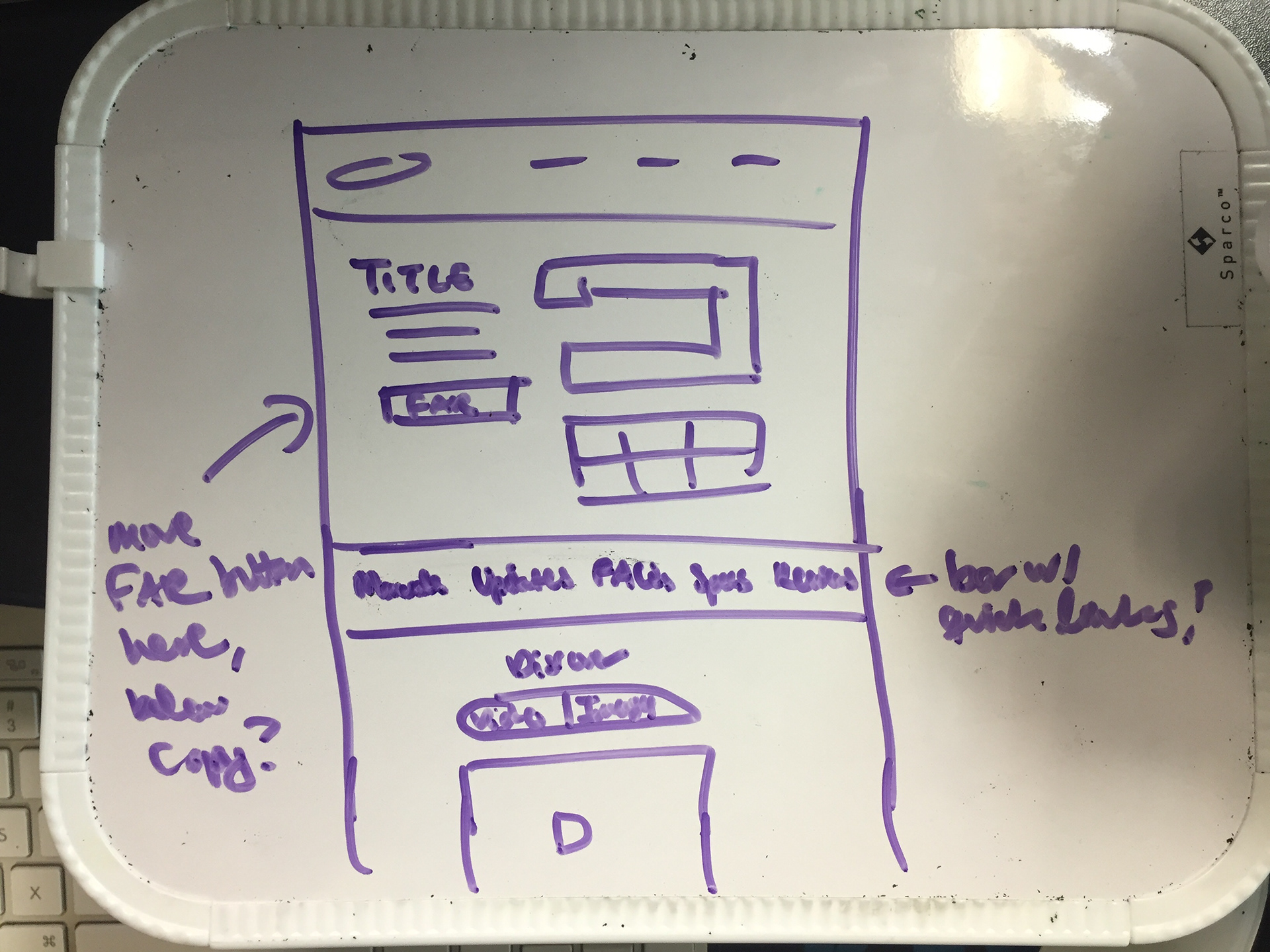
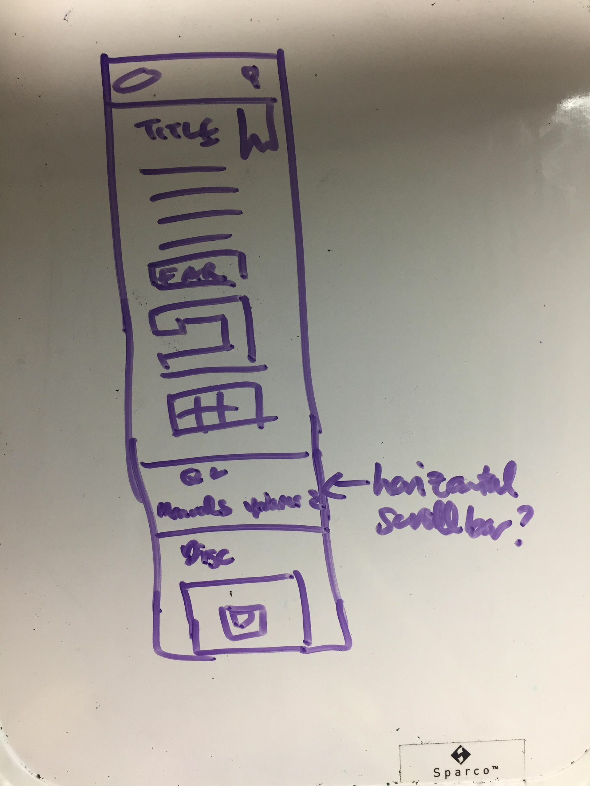
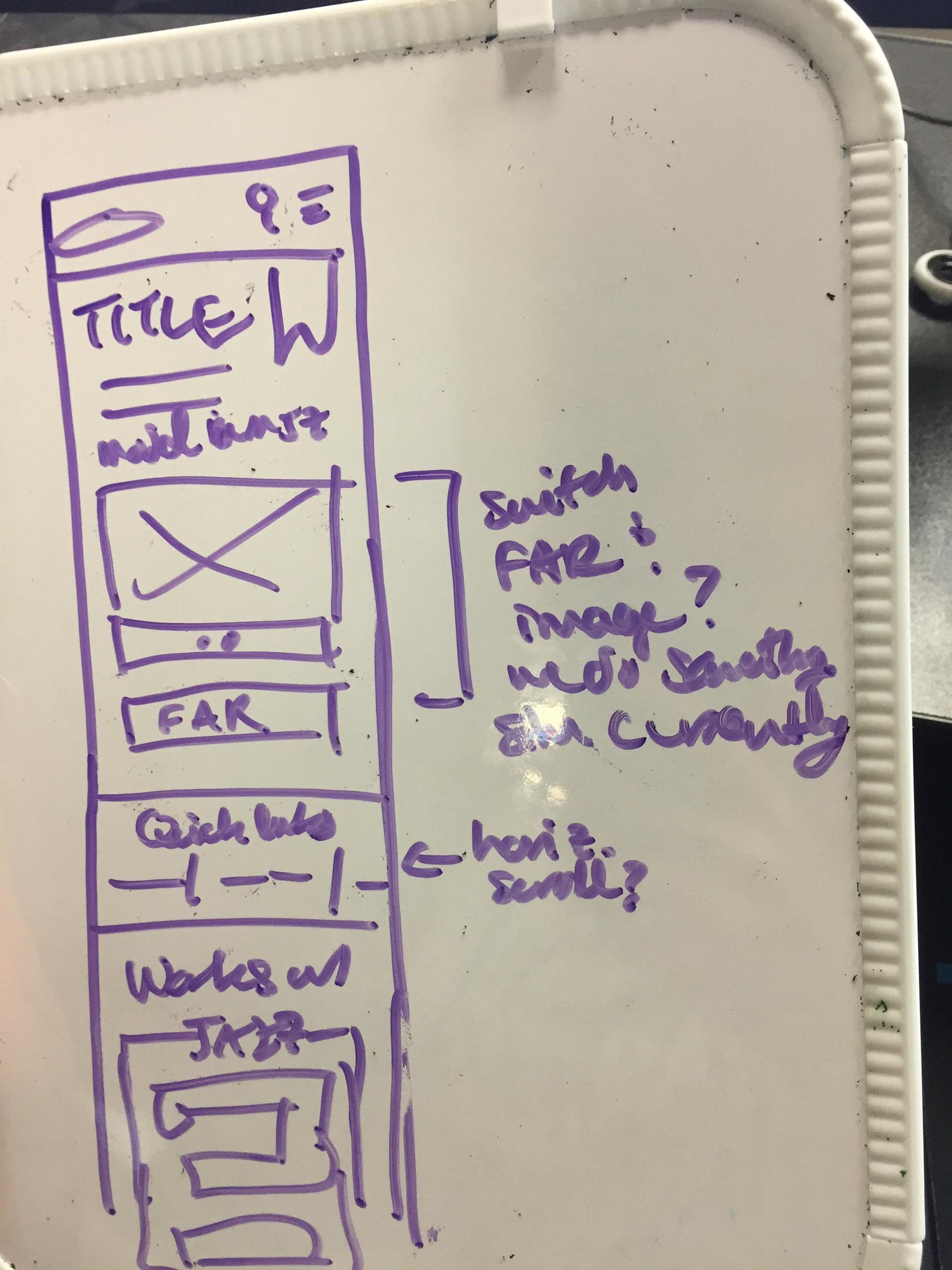
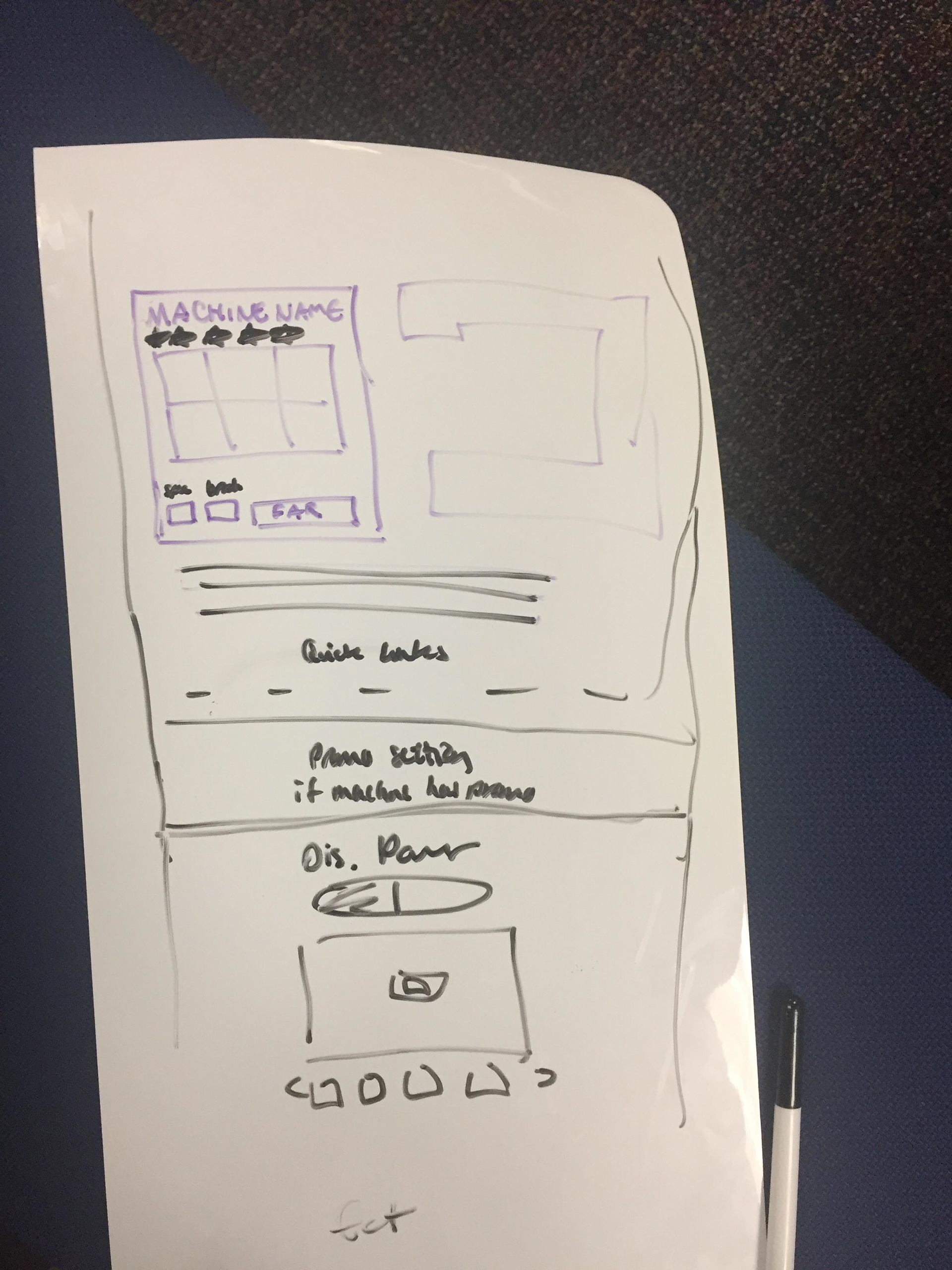
With projects like these I often start with some whiteboard sketches. I find it's the easiest way for me to jot ideas down quickly without worrying about pixel perfection.


I did not go with a horizontal scrollbar on mobile, as I had some concerns about its usability. I also chose not to center the "quick links" bar or put it in its own special banner, since doing that would cause it to clash with the promotions banner that appears below this section when a product has a special deal tied to it.
Finished Product
I added a Find a Retailer button to the top of the page. I renamed "Quick Links" to the more descriptive "Additional Product Details" and added a new "Compatible Accessories" link. At the bottom of the page, an additional Find a Retailer callout remained.
Thanks for viewing!
