
I designed this one-page checkout with versatility in mind. I created basic wireframes as each site would have a version of the checkout with its own branding.
You can see a modified version of this checkout live at Koala Cabinets, a high-end custom sewing cabinet site.
You can see a modified version of this checkout live at Koala Cabinets, a high-end custom sewing cabinet site.
Challenges and Goals
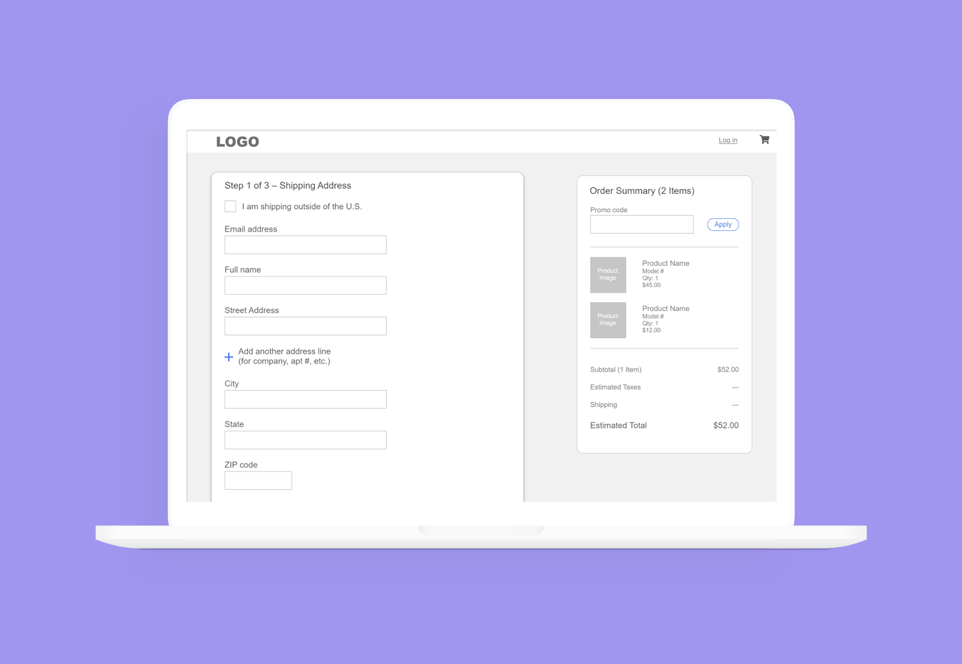
We needed a checkout flow that could apply to any of our sites. Over my 3+ years at Tacony, the web team relaunched seven websites (three of which are e-commerce) on our custom built content/product management system. We wanted to create one checkout flow that would only have styling changes and very slight modifications between sites. The basic steps for all checkouts are:
1) Shipping address
2) Shipping method (separated out for Koala Cabinets)
3) Billing/payment
Our basic requirements included:
- Versatility to add/remove steps and apply different styles
- Simplified navigation for checkout flow
- Single page, with each step collapsing and the next expanding as the user progressed
- Make next/place order buttons as accessible as possible
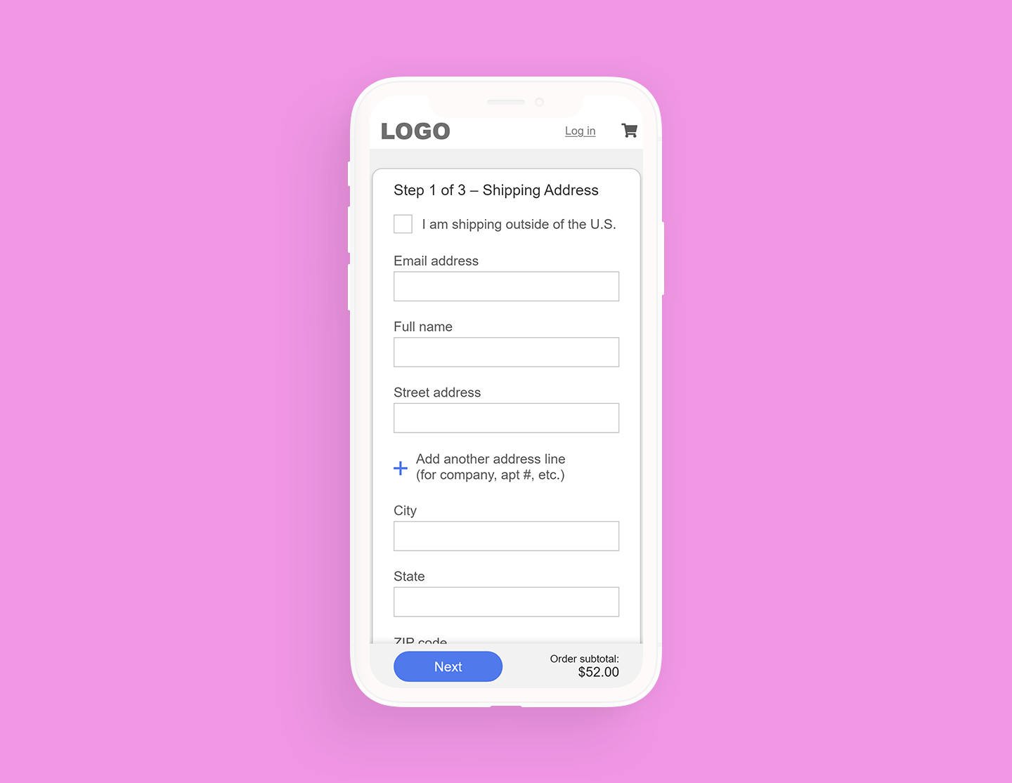
Note the "Next" bar at the bottom, which stays anchored to the bottom of the mobile viewport.
Shipping Address
We asked if the user was shipping internationally first, as checking this field would cause this part of the flow to change:
- A country dropdown would appear
- State and ZIP would change according to which country the user selected
I suggested we put the ZIP code above city/state, and have it autofill the user's city/state. We didn't go that route because using a ZIP code lookup service would have been too cost prohibitive for us.
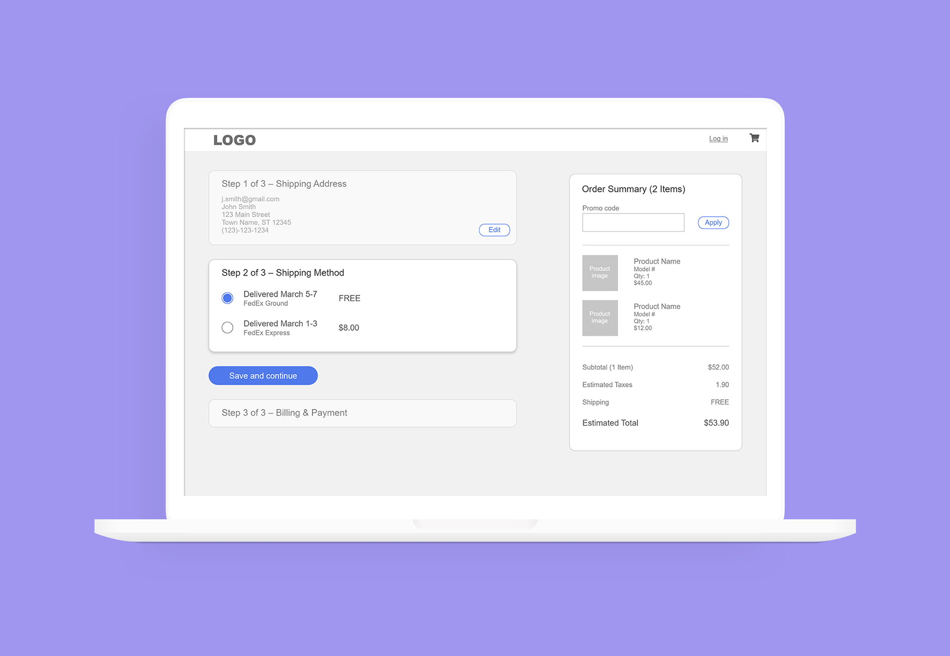
Shipping Method
I split this out separately from the other steps for Koala Cabinets (our most complex e-commerce site), as it is the only site that offers multiple shipping methods that may affect the items in the user's cart differently. On other sites, the shipping was combined with the Billing & Payment screen.
In an ideal world, we would show the user an estimated delivery date for shipping.
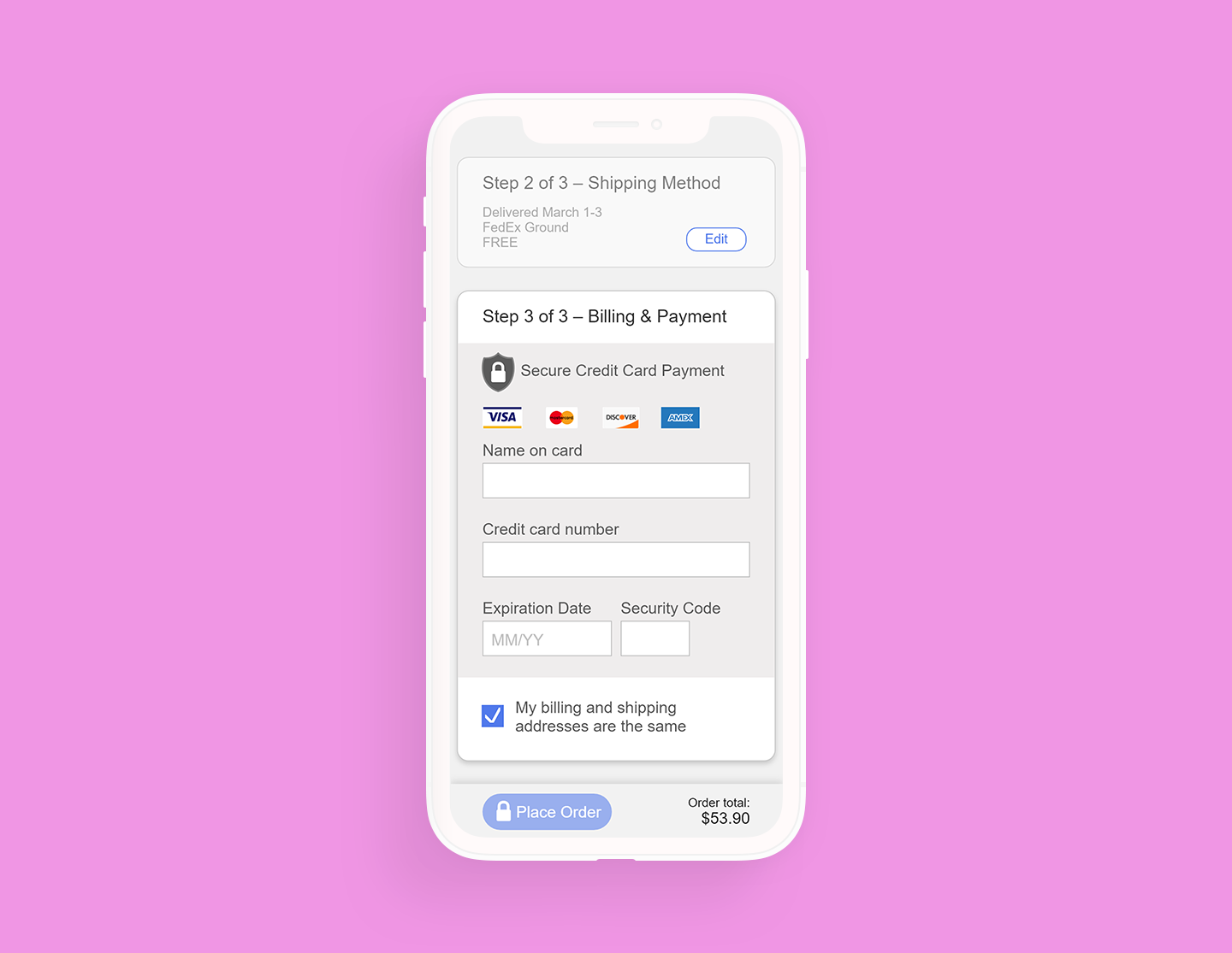
Payment Details
In the payment detail step, I added a special lock icon near the "Payment Details" headline, and put the credit card details in a box with a slightly darker background than the rest of the flow. While these don't do anything specifically, they do bolster this section and add to its perceived security.
The Next button has changed to a Place Order button (with a lock icon, again, to add to its sense of perceived security), and is grayed out until the user fills out all fields.
As most of our users use the same shipping address as their billing address, I defaulted them to be the same in our flow. If that box is unchecked, an address form appears.
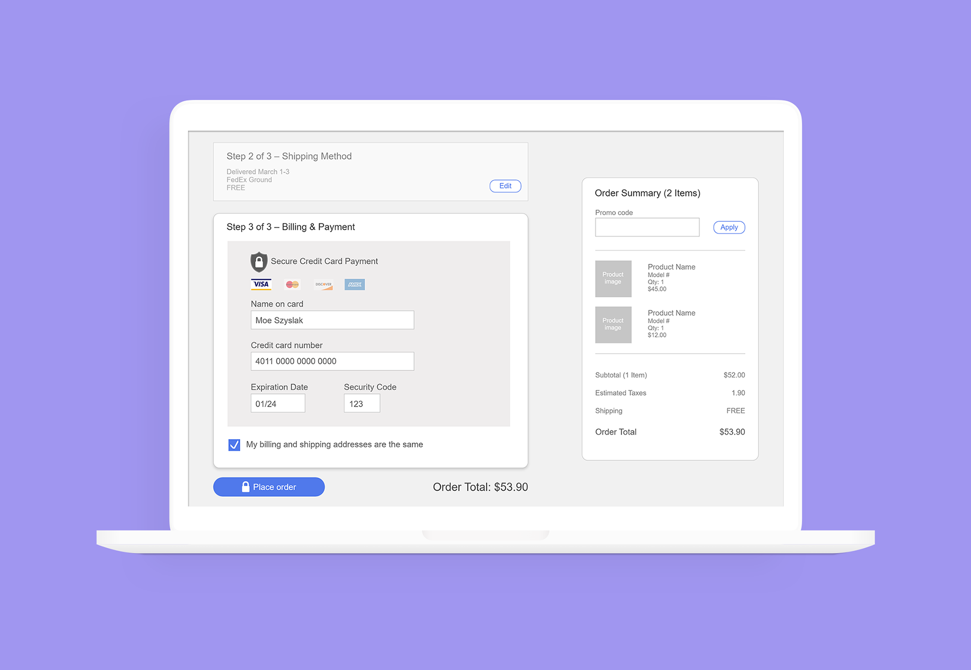
When the user adds their info in, the appropriate credit card is highlighted and the rest fade. The place order button becomes active.
You can view a modified version of this checkout live at Koala Cabinets.
(This site requires an account to purchase, as Koala Cabinets are expensive and custom-made. Fancy!)
Thanks for viewing!