

ADA Compliance
Not all of the new brand colors meet the ADA's requirements for color contrast. I chose color combinations that would ensure text was legible and would pass AA standards.
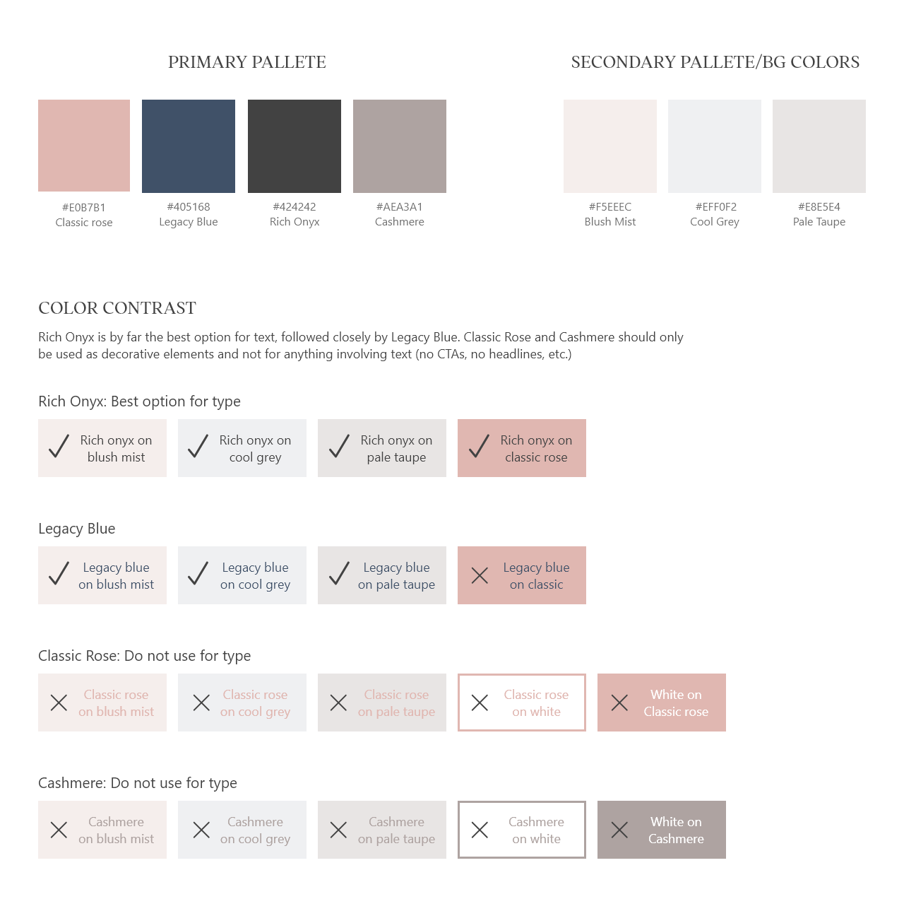
I chose the dark blue color for the site's main call to action buttons, as the dark blue had the most contrast from the rest of the site's muted colors.

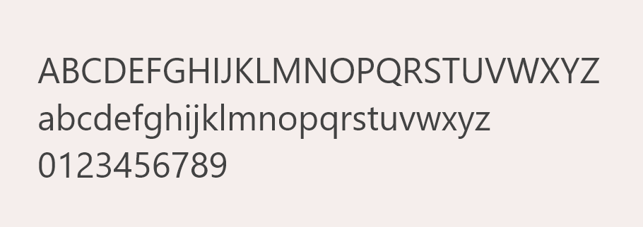
Web font adaptation
While the original print branding used Avenir, purchasing it for the web was prohibitively expensive. (At the time of this project, Nancy's Notions received roughly 50 million page views per year. The price of Avenir increases with the number of page views the site it's on receives, so purchasing it for web use would have cost $17,000/year.)
Instead, I proposed we use Haboro Soft Norm Book. This font paired well with Addington CF (our headline font) and was available through Adobe Fonts, which we already had a subscription to.
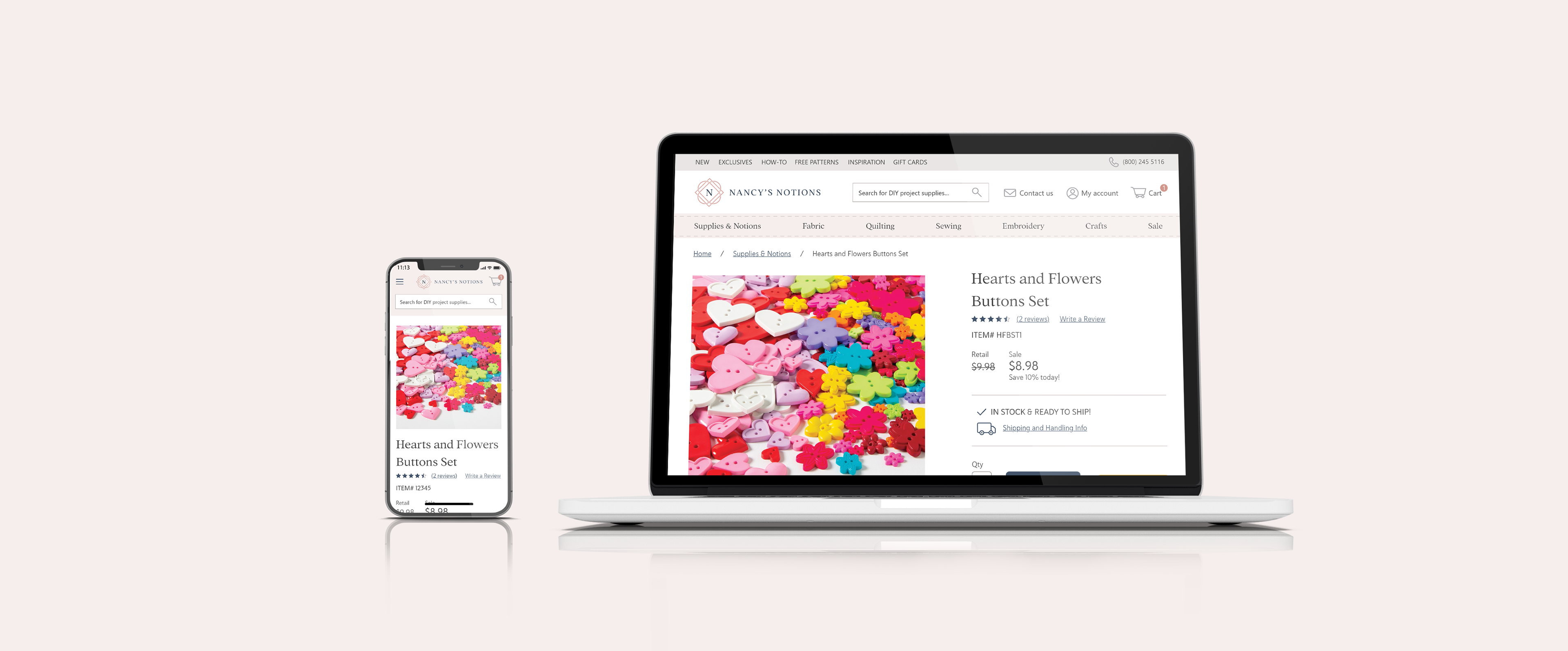
The final product
With these new styles, the site received a fresh coat of paint that aligned it with its new print branding.
Thanks for viewing!