Challenges
- Adding a ratings and reviews system to a non e-commerce site
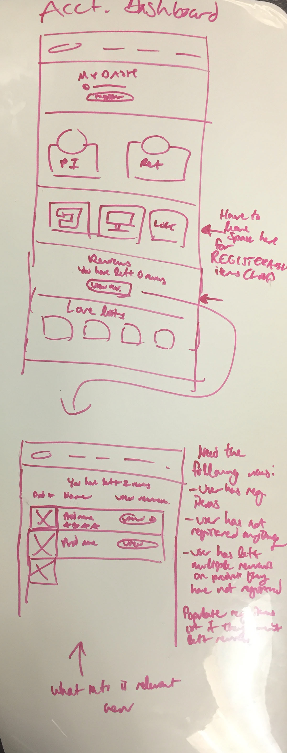
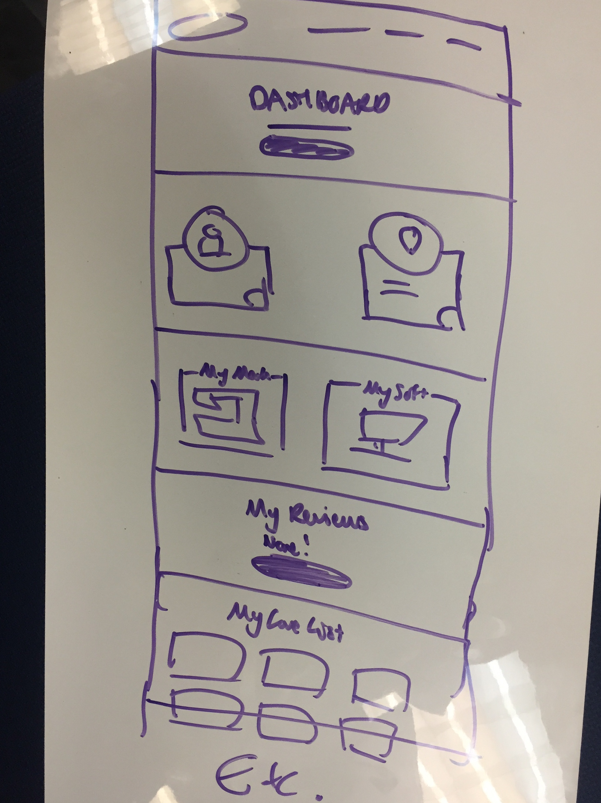
- Adding a reviews section to user accounts
- Planning for rejected review flow
- Commenting and responding to comments
- Update the compare tool to pull in review ratings
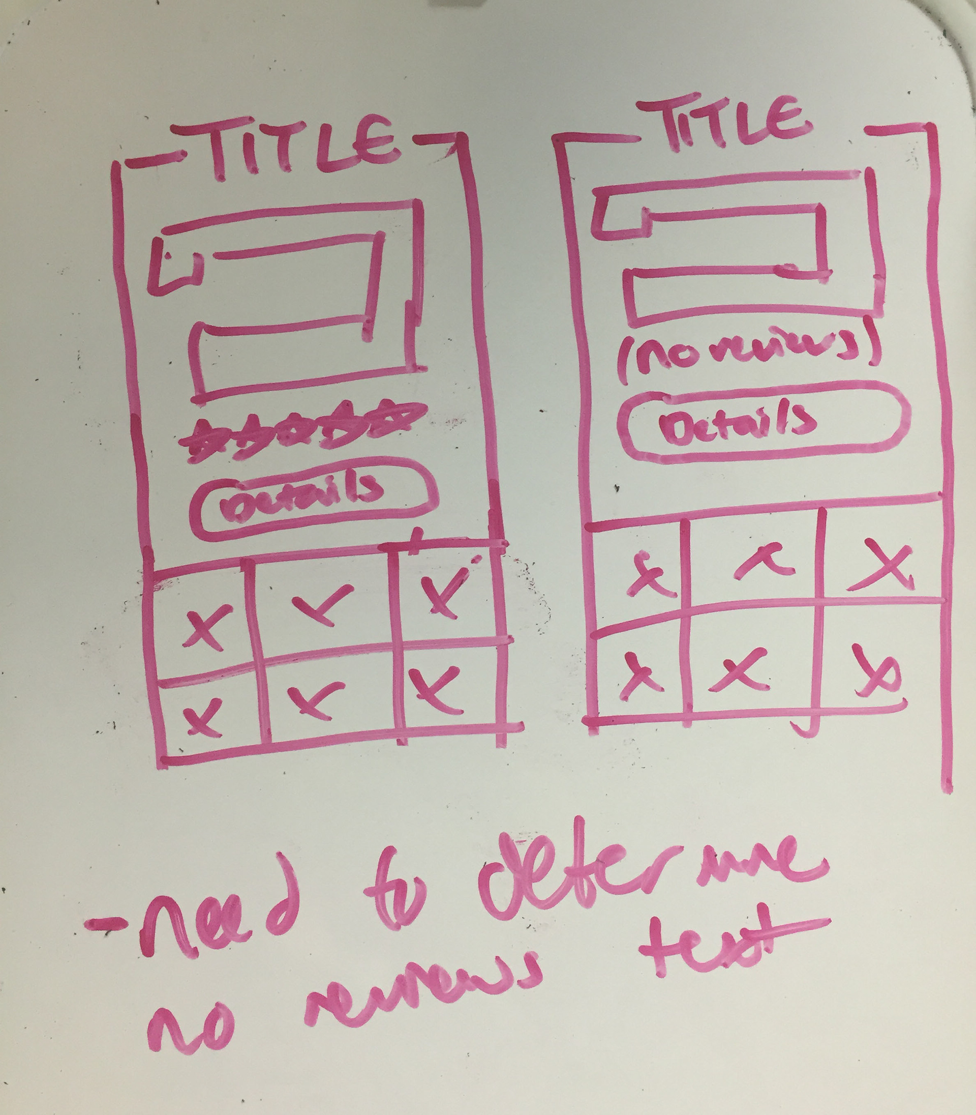
- Updating the product display pages and product listing pages to include reviews
Initial Steps
I was fortunate to have the business requirements from the get-go. After a conversation with our developers and a competitor analysis, I got to work.
User Flows
I love using a whiteboard to quickly sketch user flows out; there's just something about writing on an impermanent medium that makes it easy to churn out idea after idea. (I take plenty of pictures, of course!) I use this user flow shorthand method when whiteboarding flows.
For larger projects like this, I usually gussy up my user flows to make it easier for stakeholders to see and approve them:
Other user flows I made focused on the various ways a review could be created, and how the user would interact with rejected reviews, comments, etc.


Wireframes
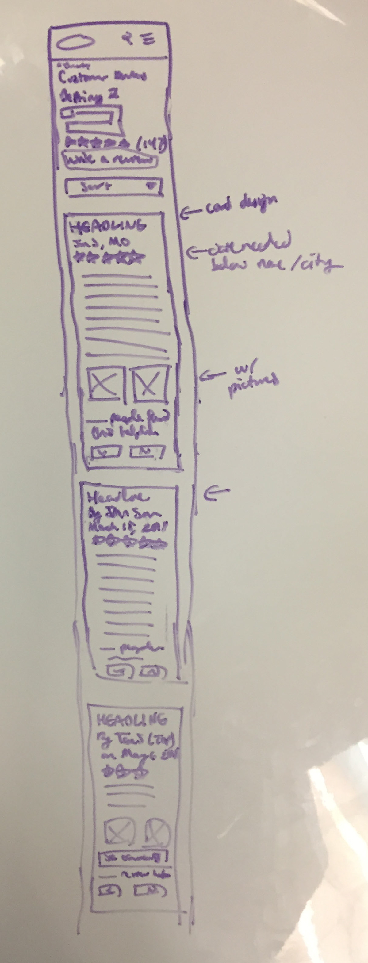
Next, I took a look at the pages I would need to incorporate into this and began sketching them out. Again, I love starting with sketching on a whiteboard to get ideas out quickly.
Designs
Once I had completed my user flows and initial wireframes, I put them together as a styled prototype using Adobe XD. I find this is the best way to hand off flows to developers for projects like this that are on existing sites, since it combines styles with interactions.
For this portfolio piece, however, I've selected a sampling of screens.
Desktop reviews screen for a product
Reviews pages
I gave reviews their own page separate from the rest of the product display page (PDP). This was done since we wanted to avoid drastically altering the PDP. If Baby Lock were an e-commerce site, I would have placed reviews on the PDP itself.
Mobile review screen, scrolled down to show a sample review.
When clicked, the images open in a lightbox. Reviews are paginated at 10 per page. Users can sort reviews by most recent, most helpful, highest rated, and lowest rated. Reviews are sorted by most recent by default.
Leaving a review page, desktop
Leaving a Review
The following info is needed when a review is left:
- Title
- Rating
- Review body
- Reviewer name (either first name and last initial, or anonymous)
- Location (optional)
- Images (optional)
Tips & guidelines expand to show some helpful hints on best review writing practices. Terms and services link out to a separate page.
Review screen in account
Account Screens & Subscreens
Users must be logged in to leave reviews. In their account, they can access all reviews they have left. Reviews show their statuses (pending approval, published, and rejected). The reviews page will also pull in items the user has registered, to encourage them to leave reviews on products they own.
Rejected review screen in user account. This review was rejected for talking about the store it was bought at and not the product itself.
Rejected Reviews
If a user clicks on a review of theirs that was rejected, they will see an explanation for why it was rejected, and given a chance to revise it. Once edited, the review must be approved by a customer service admin before it will be published on the site.
An example of an approved review with a customer service comment left on it, and a space for the user to respond.
Commenting
I also wanted to plan for commenting. Customer support wanted to be able to comment on users' reviews, in case the user ran into technical issues or had questions. Users couldn't comment on anyone's reviews other than their own, and only if customer support had left a comment first.
Final Notes
Unfortunately, this project never went live as there were concerns over marketing/customer support resources. It's always a little sad when a project doesn't come to fruition, but I'm still grateful I was able to work on it. I learned a ton!
Thanks for Viewing!
